ModelRailroadForums.com is a free
Model Railroad Discussion Forum and
photo gallery. We cover all scales and sizes of model railroads. Online since 2002, it's one of the oldest and largest model railroad forums on the web. Whether you're a master model railroader or just getting started, you'll find something of interest here.
Certified Great Northern Nut
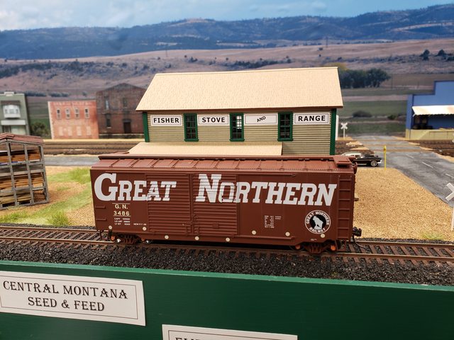
This is actually the Right On Track Models kit of Empire Stove and Range, but I didn't like the signs they provided and I wanted to change the name.
Here is a photo of the sign I came up with. I haven't permanently attached it yet and I need to decide whether it's going to be a decal or whether I'll try the "sand the back down" method of attachment.
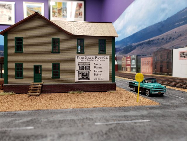
(Click the image for bigger)
Thoughts? Opinions?
Days Gone Bye!
Staff member
Me too sand it down! Always thought that was trick! Haven't done it myself, what to though..... I think it would look good on that building!
The lettering and picture is too fine for a clapboard building. They would use wider lettering and probably a sans serif, all uppercase. As a billboard, fine, but on a clapboard building would be really difficult to paint.
Agreed with Dave. My first thought was "frame it, and have it standing at an angle in the corner."
Certified Great Northern Nut
What do we think of this one? I agree that having the stove on there was a bit busy.
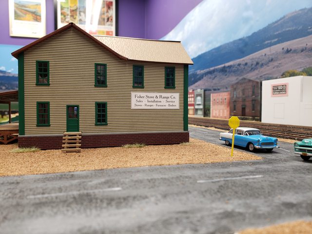
Or maybe up high?
I like this one, maybe centered left to right, top to bottom, in the open area, though?
If your going to hang it on the outside , you might want to frame it . I guess it depends on whether their "renting " or own the building. If they own it , decal it ,if renting hang it on the outside , so when the rent gets to high , you can chuck it in the back of the truck and take to the new location .
I'd do it in the down right position, with the top of the sign even with the top of the windows.
Certified Great Northern Nut
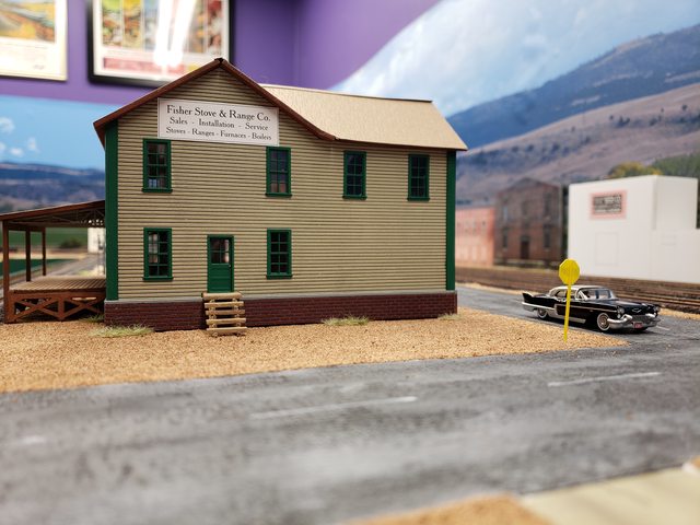
Came up with another version - I think I like this one.
Also made some to put on the track side of the building. (They might need a tweak.)
Diagonal "And" is a nice touch. Last effort is very clear and easily read from the road.
Certified Great Northern Nut
Diagonal "And" is a nice touch. Last effort is very clear and easily read from the road.
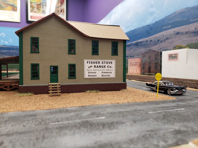
Thanks. I googled signs painted on buildings for ideas and the diagonal "and" struck me as an interesting feature.
I know its a pain in the butt, but I know for me, going through several iterations can get a better looking end result.
What software are you using for the signs? My two favorites are MS Excel and Power Point
Certified Great Northern Nut
I know its a pain in the butt, but I know for me, going through several iterations can get a better looking end result.
What software are you using for the signs? My two favorites are MS Excel and Power Point
I'm using Inkscape - an SVG editor. I also use Gimp for raster/photo work. Both are open source tools. Inkscape is an open source copy of Adobe Illustrator and Gimp is an open source copy of Photoshop.
I don't mind making multiple iterations. I think it's kind of fun.
I'm also trying to use fonts that would have been used pre-1958. Tony Thompson has written a
few good blog posts about using era appropriate fonts.

Affiliate Disclosure: We may receive a commision from some of the links and ads shown on this website
(Learn More Here)