ModelRailroadForums.com is a free
Model Railroad Discussion Forum and
photo gallery. We cover all scales and sizes of model railroads. Online since 2002, it's one of the oldest and largest model railroad forums on the web. Whether you're a master model railroader or just getting started, you'll find something of interest here.
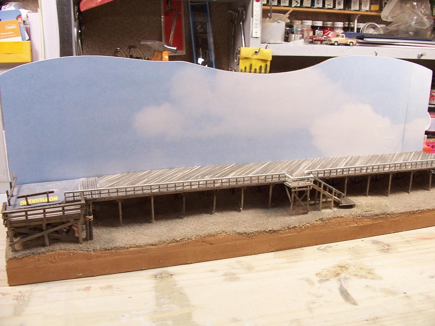
I picked up this printed poster board with clouds on it at Staples. I think it cost around $2.00. I cut a scrap of Masonite for the back and glued the sky on it. It was a piece of scrap that was full of nail holes. I cut around the nail holes, that's why its got curves in it.
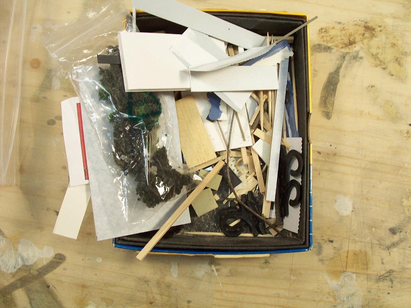
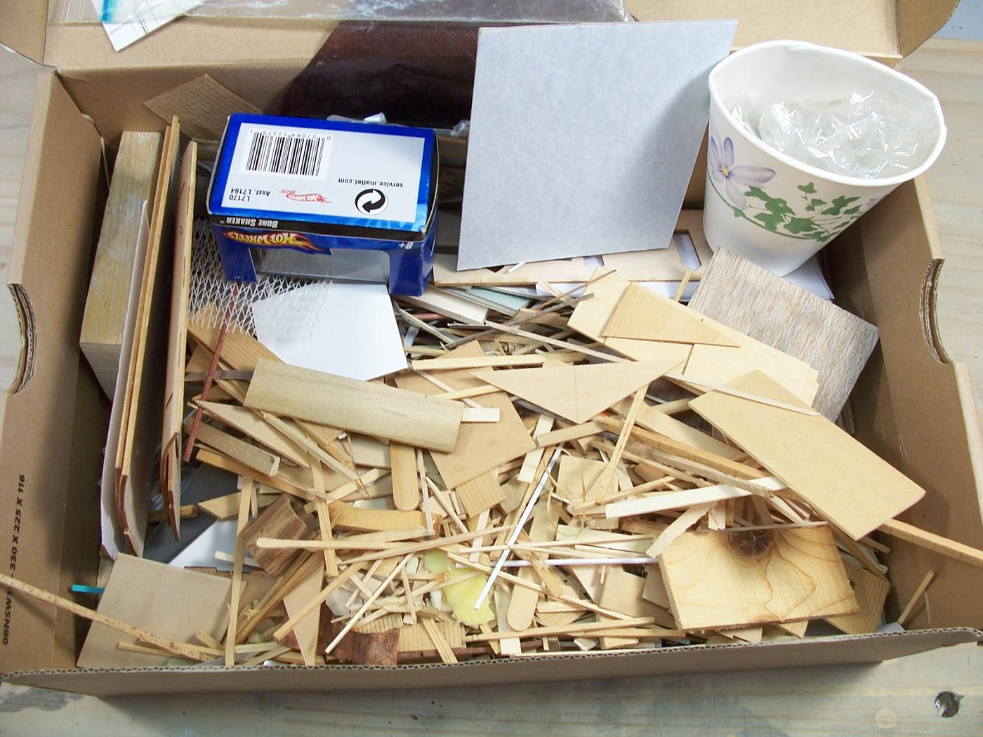
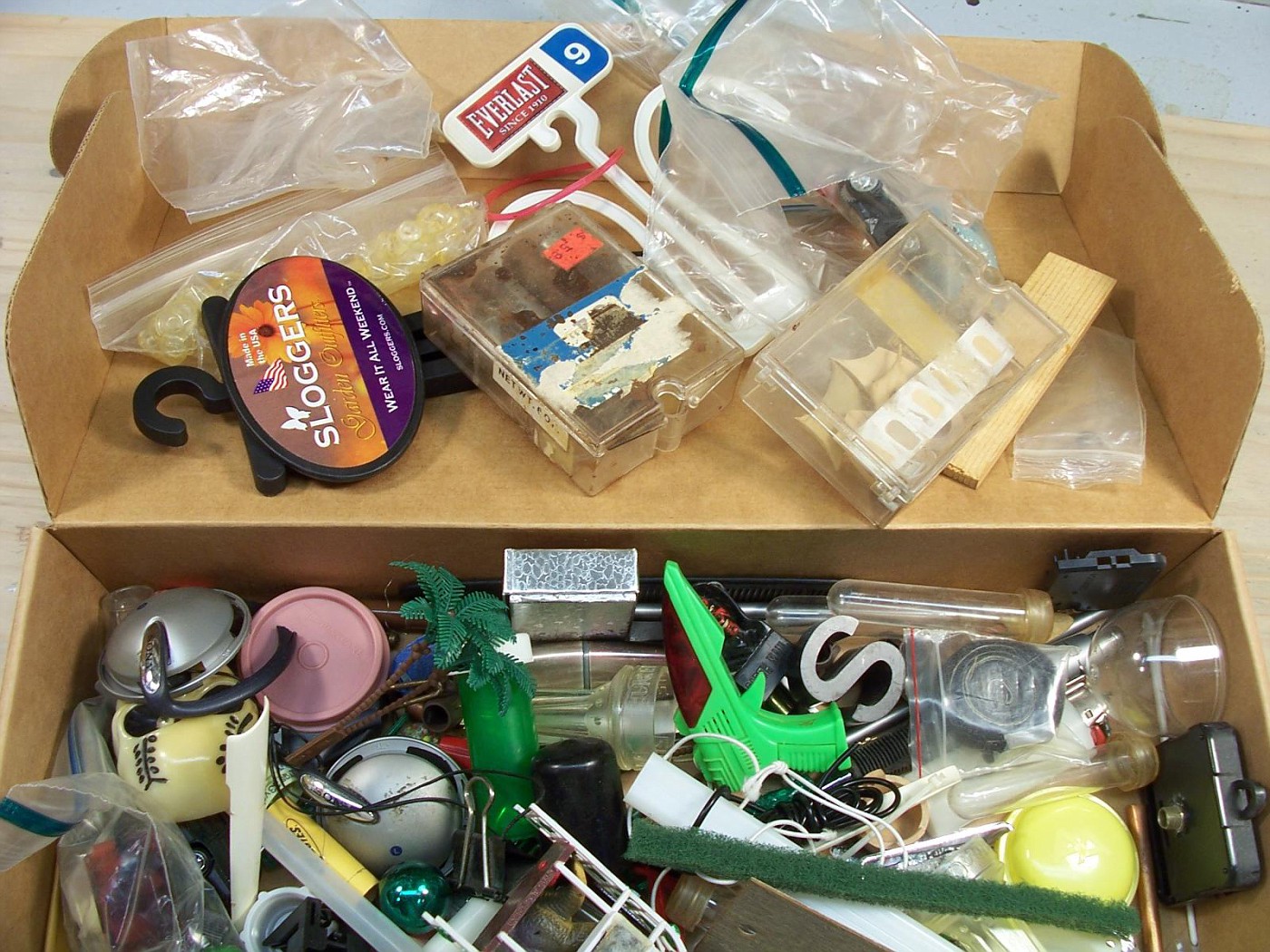
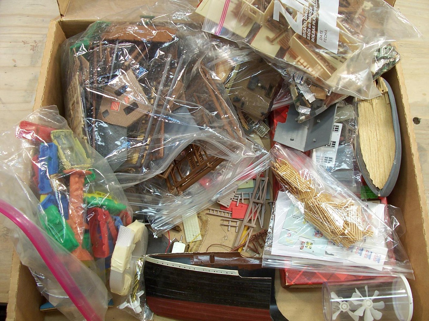
Here's the boxes of junk and "stuff" that I'm trying to get rid of.
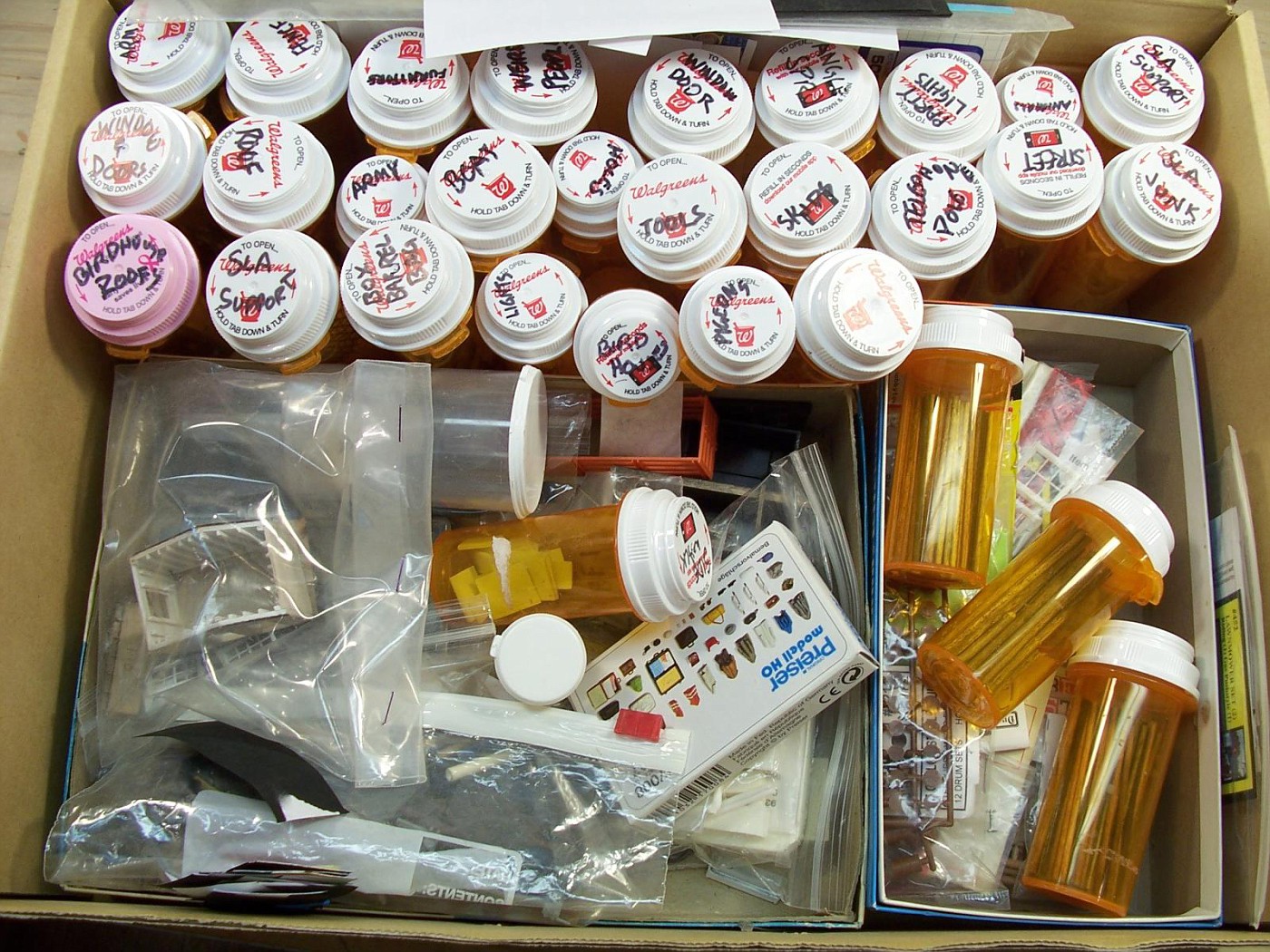
This is the one I keep on my bench until it gets full.
These are the ones that have all the other weird stuff and scraps.
This is the box that I have stuff sorted out. I go into this box a lot. It's pretty well organized.
So...
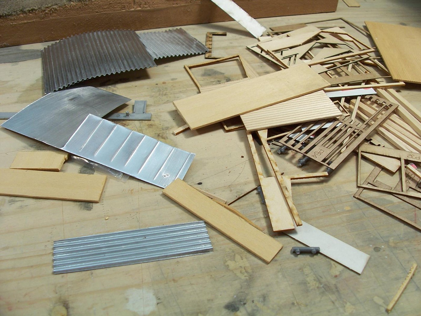
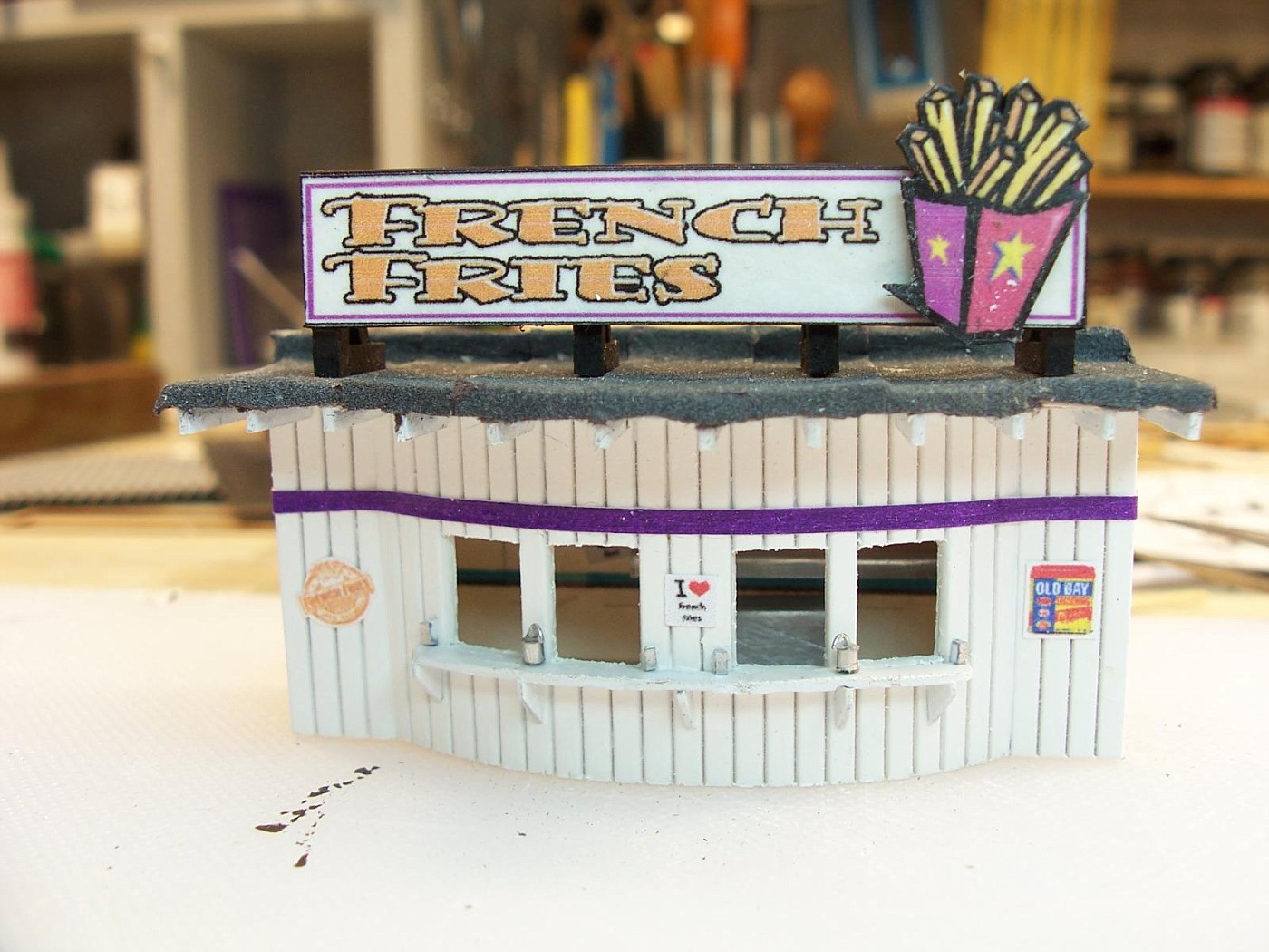
I just grabbed a hand full of stuff and started sticking it together with out any real plan other than it's a french fry place.
Here's what I came up with so far.
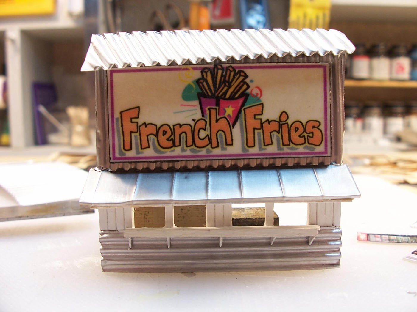
I'm not sure if I'm going to use this one or not. Everything is crooked and it's kind of sloppy looking.
Don't know about anyone else. but the french fri shack looks good to me. and don't sweet the crooked edges i have seen beach shack used as store that wherr preety rough. in real life.
The more I look at it the less I like it. I'm going to give it another shot.
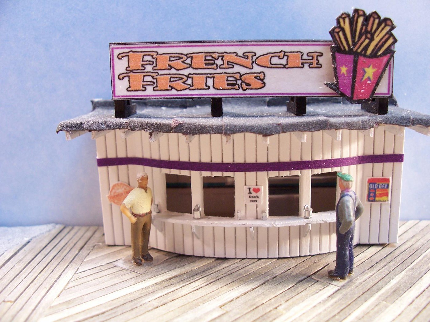
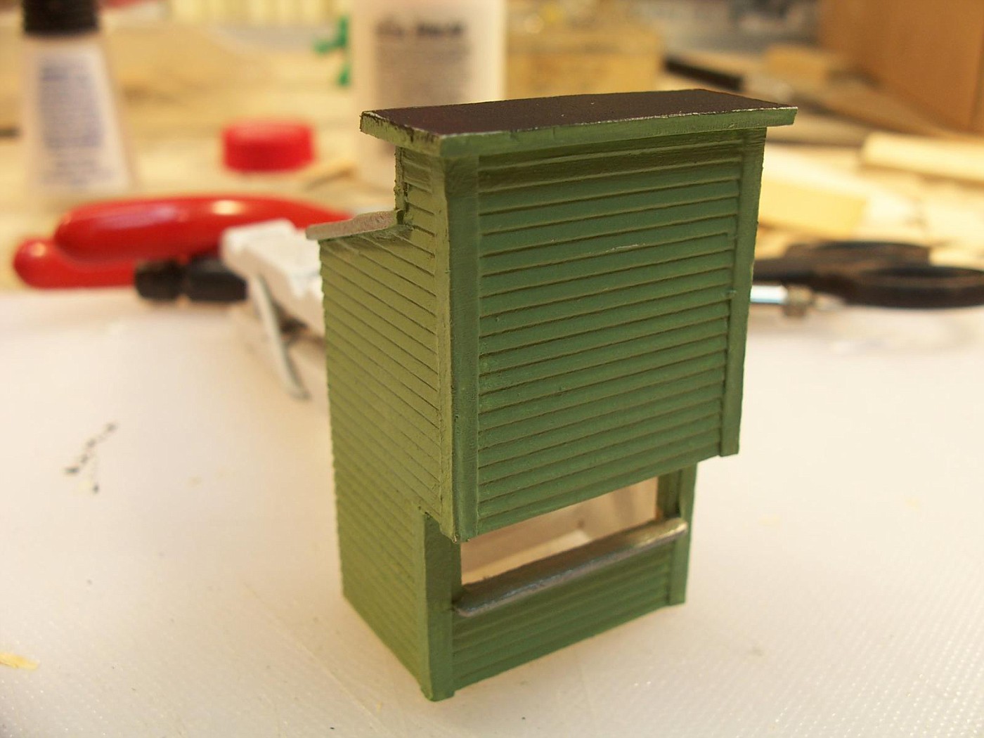
I started over and came up with this. I like it a lot better.
Northern Pacific history enthusiast
The building looks really good and the details on the counter as well. I am not super excited about the sign, though, and can't seem to put my finger on how to improve it. lasm
If I may respectfully suggest, its too clean. It needs little light fixtures attached to shine it up at night. A little damage and grim for character, fade the colors a bit. More junk up on the roof.
Not to mention a young Bruce chasing all them factory girls underneath the boardwalk, where they all promise to unsnap their jeans...
Sent from the DairyStatePhone. Typoes and bad auto corrects included at no extra charge.
Thanks. I'll probably add more stuff. I'm not going to do much weathering until I get more buildings done. I'm agree about the sign. I'm not sure about it ether, but it is sort of growing on me.
Well-Known Member
Staff member
The first sign was definitely "over the top", but that's what made it appealing (and persuasive from a commercial competitive point of view)
I don't think either sign is over the top-it fits in with the boardwalk theme of attracting attention, and therefore, the tourists' money! A little weathering and it's perfect!
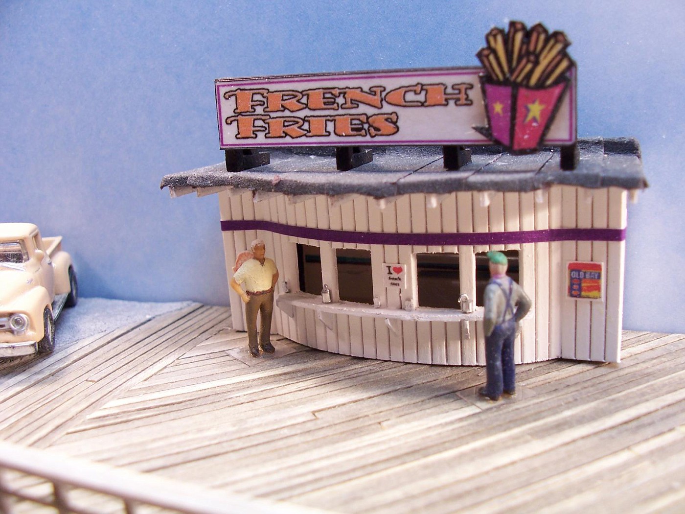
Remember the old Atlas refreshment stand? There's a perfect piece for a boardwalk, or in my case, the thinking about doing amusement park.
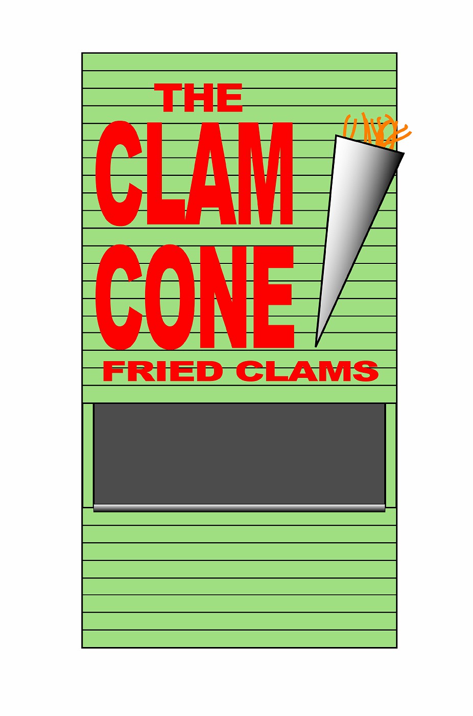
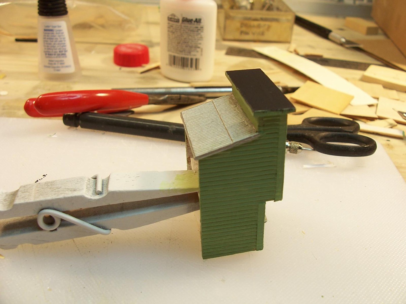
I did a sketch for the next building. I'm thinking the part of the building over the window should overhang the window a little bit. I want to make the cone out of something so it will be 3D and then paint the lettering on building.
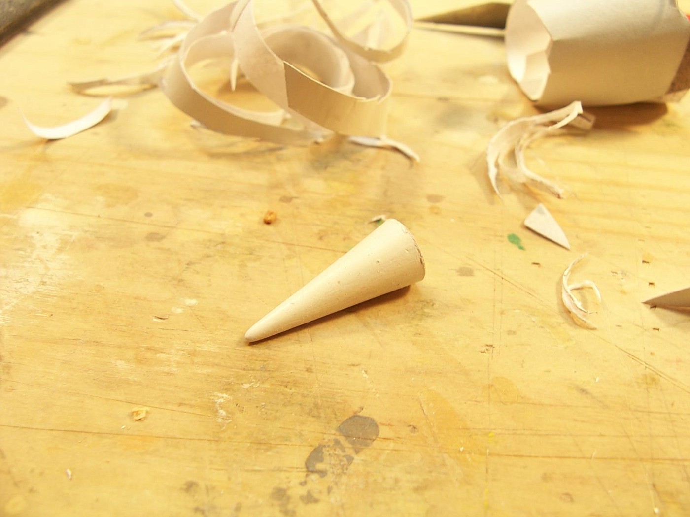
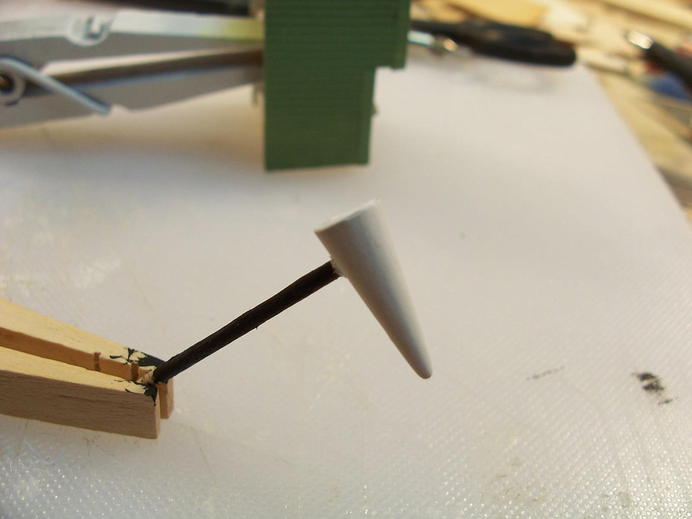
I couldn't find anything that I thought would be good to use the to make the cone, so I made one out of paper. I started out by rolling it into a cone shape and sticking it together with a little Elmer's glue
I coated it inside and out with super glue. Then gave it a coat of primer. A little putty and another coat of primer.
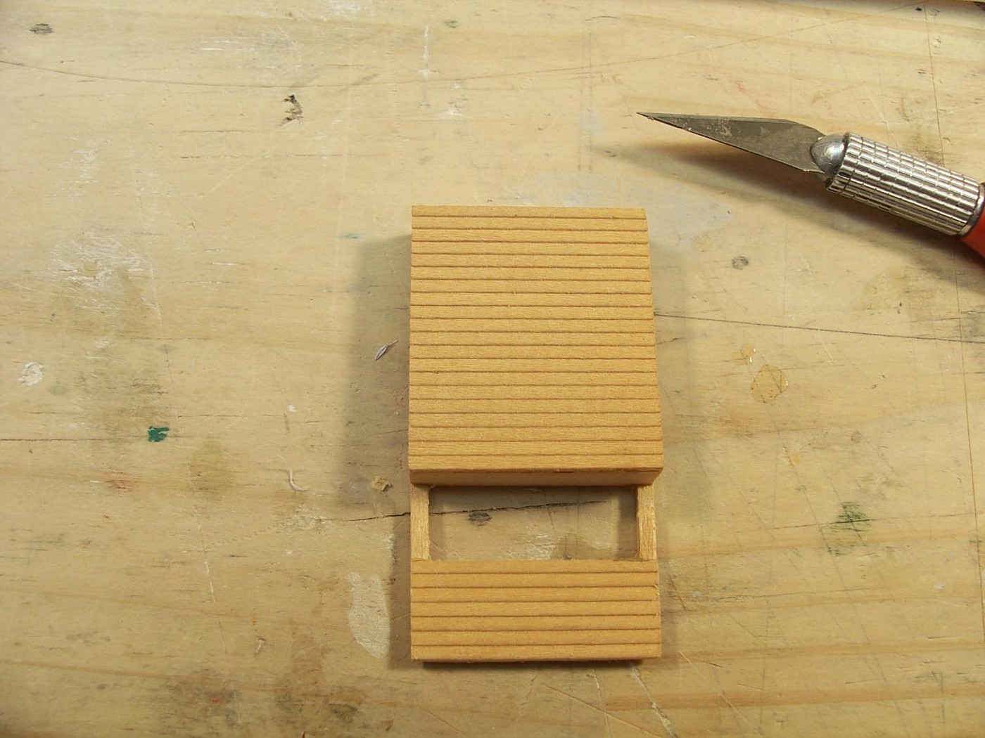
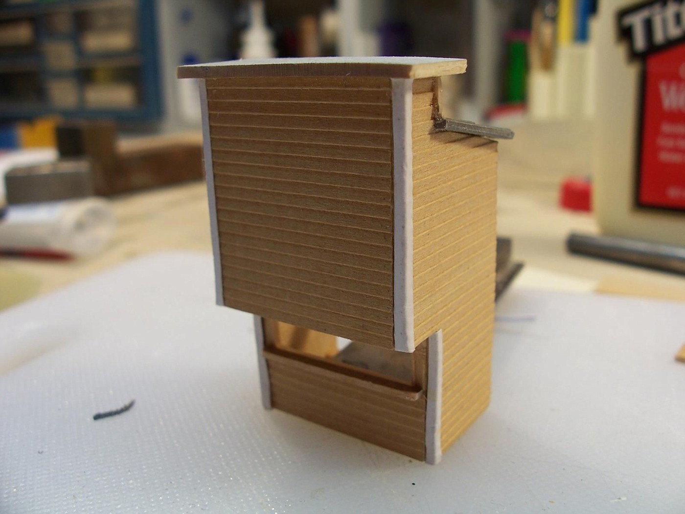
I got the building together and then I noticed that I screwed up. The siding on the sides is upside down. I'll fix that.
Boardwalk looks great, can't wait to see the other buildings as they go up.
Sent from my iPhone using Tapatalk
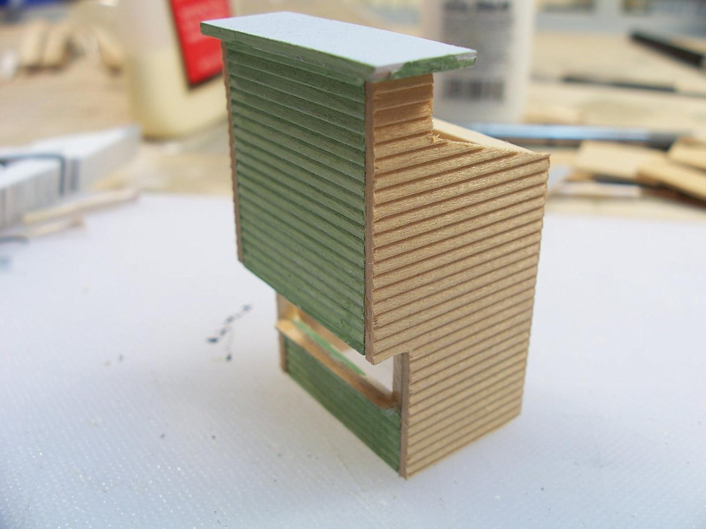
Ok! I got the siding right this time.
I got paint on this. Hopefully tomorrow I'll paint the lettering on the front of the building.
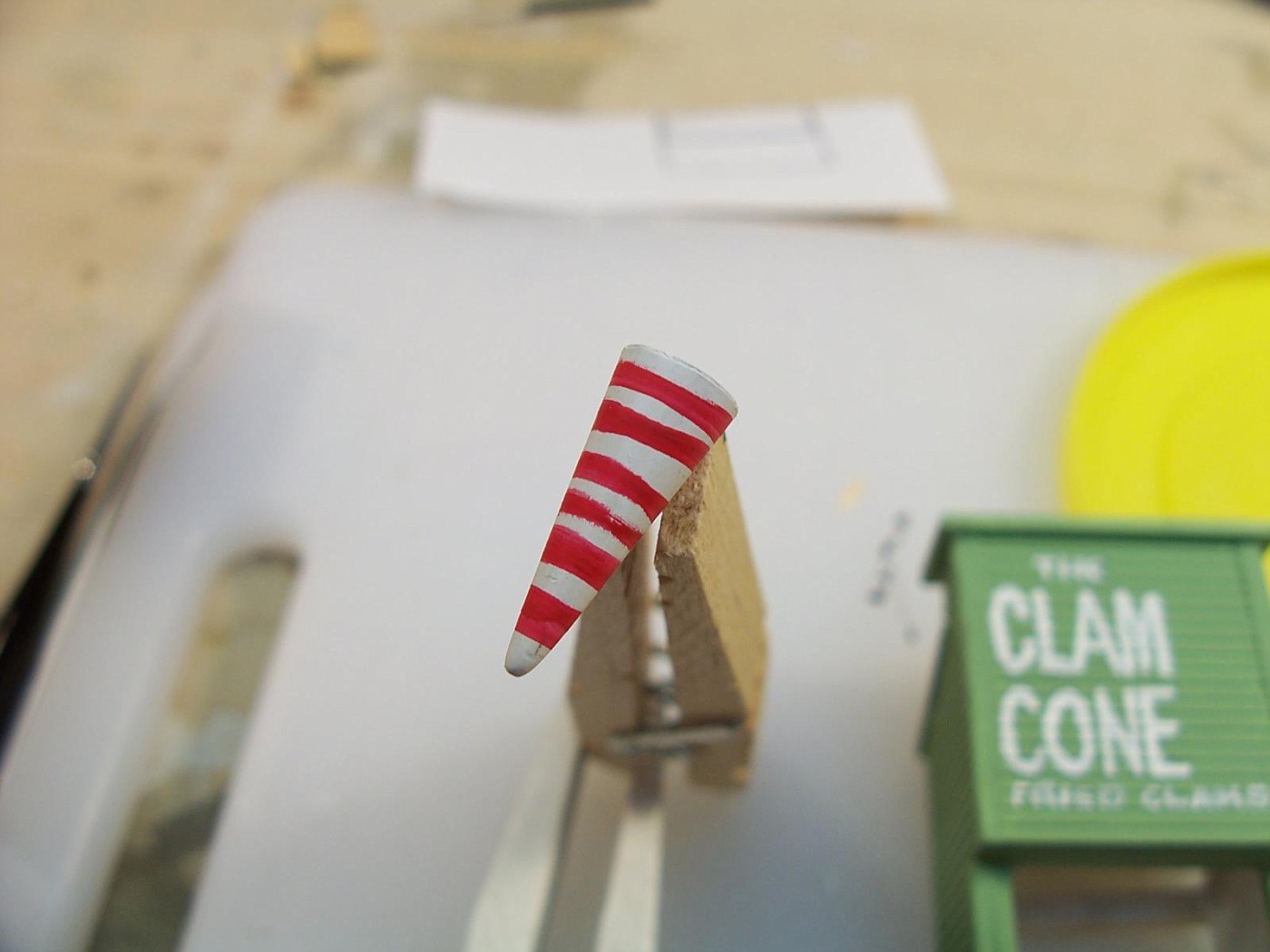
I got a base color on the cone. I'm going to add some stripes or something to it. Then add something that will look like strips of fried clams. Not sure what that's going to be yet.
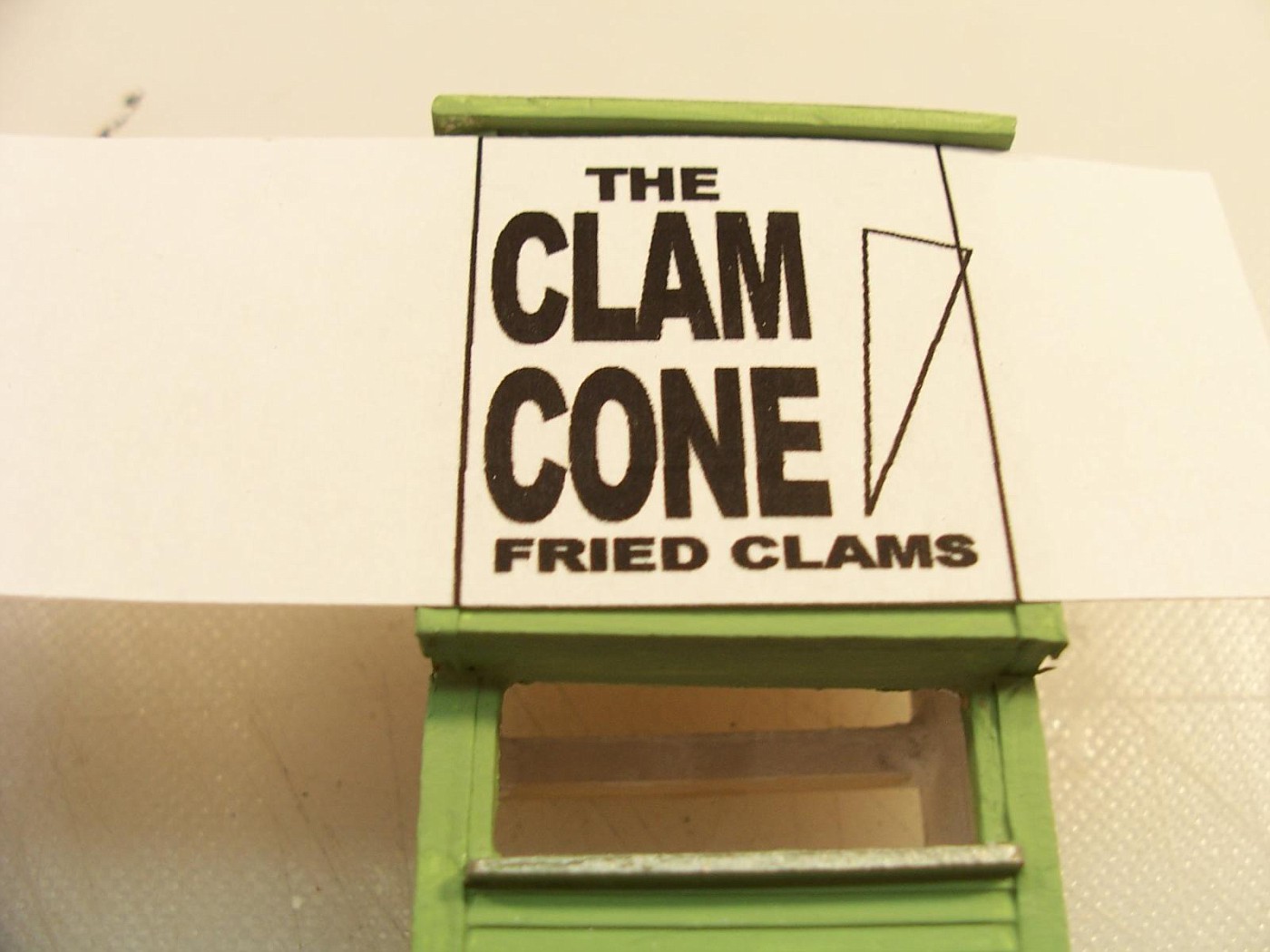
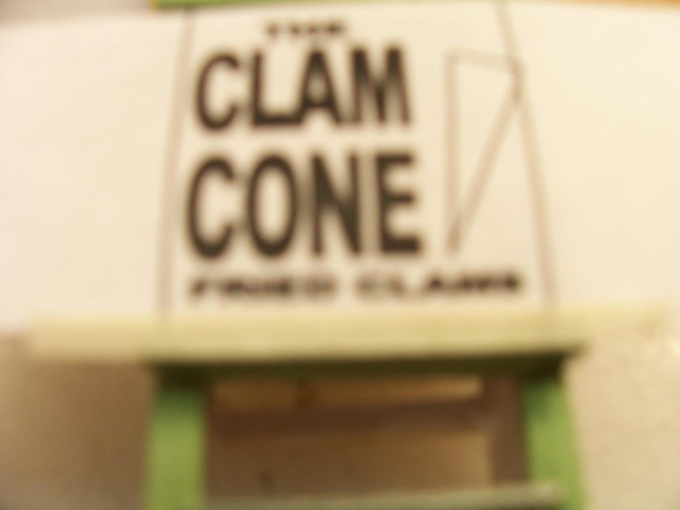
I think this building would look best with the lettering painted on the building rather than make a sign. I used Illustrator to lay it out. I printed out the lettering for the building and cut the paper out so I had a way to align it.
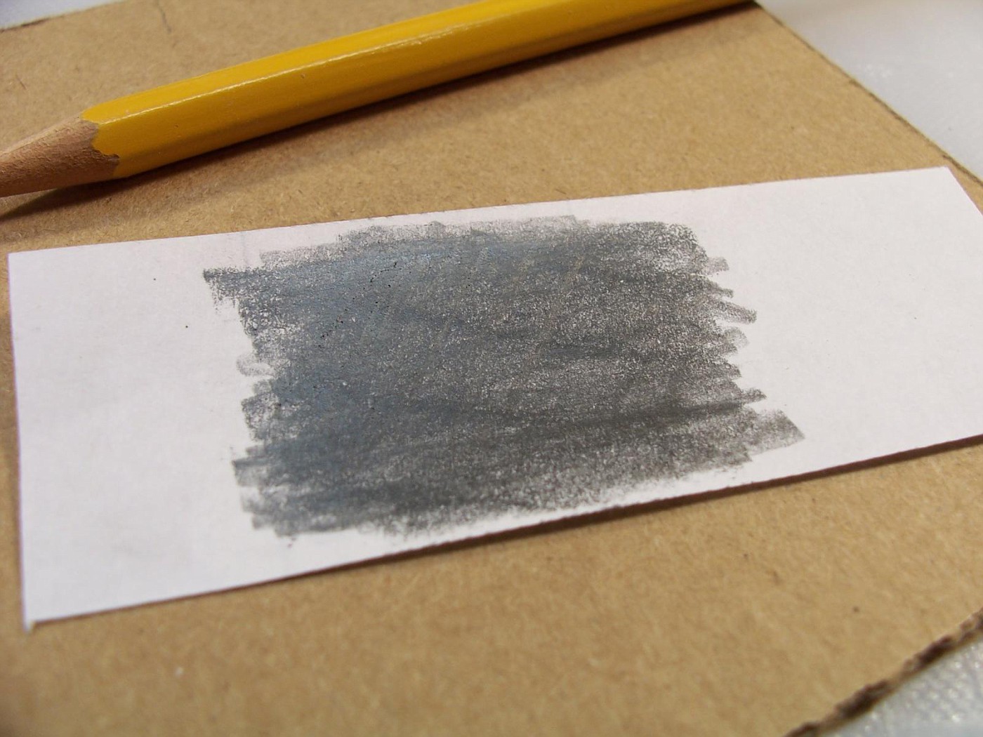
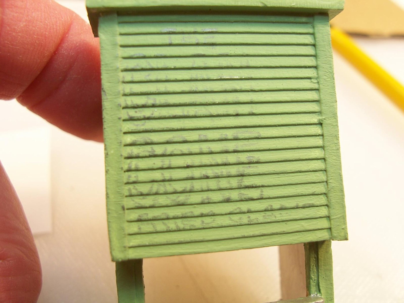
To transfer the lettering to the building I rubbed the back of the paper with a #2 pencil.
Then taped the paper to the building and drew around the edges of the letters to transfer them. Sorry about the blurry picture. To make sure that I got everything I only taped the paper on the bottom so that I could lift it without losing the position.
The image of the letters is a little bit faint because of the siding. If it was a smooth surface it would be easier, but it's close enough for what I'm expecting.
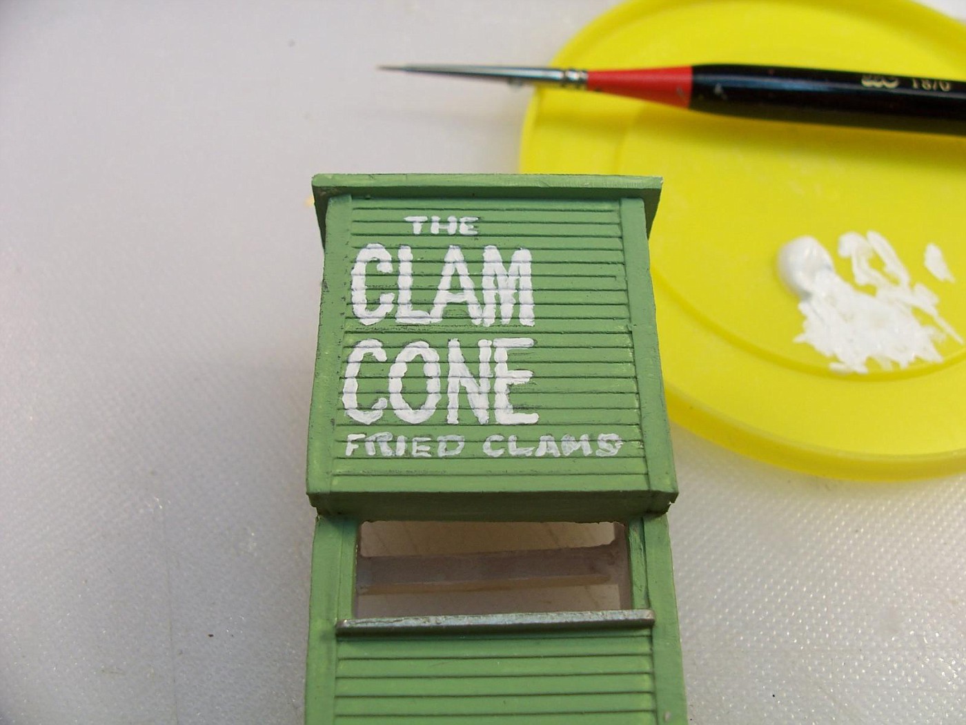
I used a 20/0 brush and Folk Art White paint thinned with a little windshield washer fluid and painted the letters.
Needs a little clean up, but it looks like a hand painted sign. I might give it an outline or a drop shadow to make it stand out a little bit.
I put crazy stripes on the cone chucking it in a drill a little off center so that it wobbled and touched it with a loaded paintbrush.
Northern Pacific history enthusiast
That is very believable lettering . Nice job!! lasm
Your scratch building skills always amaze me. I enjoy watching the progress on your builds. The boardwalk fries are probably a bit too greasy for me, and I don't like clams, so I'm waiting for a boardwalk café to open up. Will there be a surf shop with surfboards for rent or sale stacked up out front?
This work is amazing. I really appreciate your putting up each step with description. I'm learning a TON from this thread!
Thanks guys. I do have surf shop planned and probably more buildings that I'll have boardwalk for.

Affiliate Disclosure: We may receive a commision from some of the links and ads shown on this website
(Learn More Here)