Show us your...plastic structures

ModelRailroadForums.com is a free Model Railroad Discussion Forum and photo gallery. We cover all scales and sizes of model railroads. Online since 2002, it's one of the oldest and largest model railroad forums on the web. Whether you're a master model railroader or just getting started, you'll find something of interest here.


AH, I see, at the end of the platform, where the stairs start descending. Should a "Y" come back up to the platform, or would a single brace be sufficient?

Thanks!


Actually, I think there should be X-bracing. The platform should have 4 supports (treat it as though the platform were a table, with 4 legs) and X-bracing rather than the small 45-degree brace included with the kit. Of course, in the day, there was no OSHA, so you don't have to include the extra bracing, but I think it would look more realistic.
 
Thanks! I'll see what pieces remain to accomplish something a little more true to life. Thanks for the help!!
 
Thanks for the comments, guys. I'm gonna russle up a few pics of my layout so's you can see how it all fits together....
 
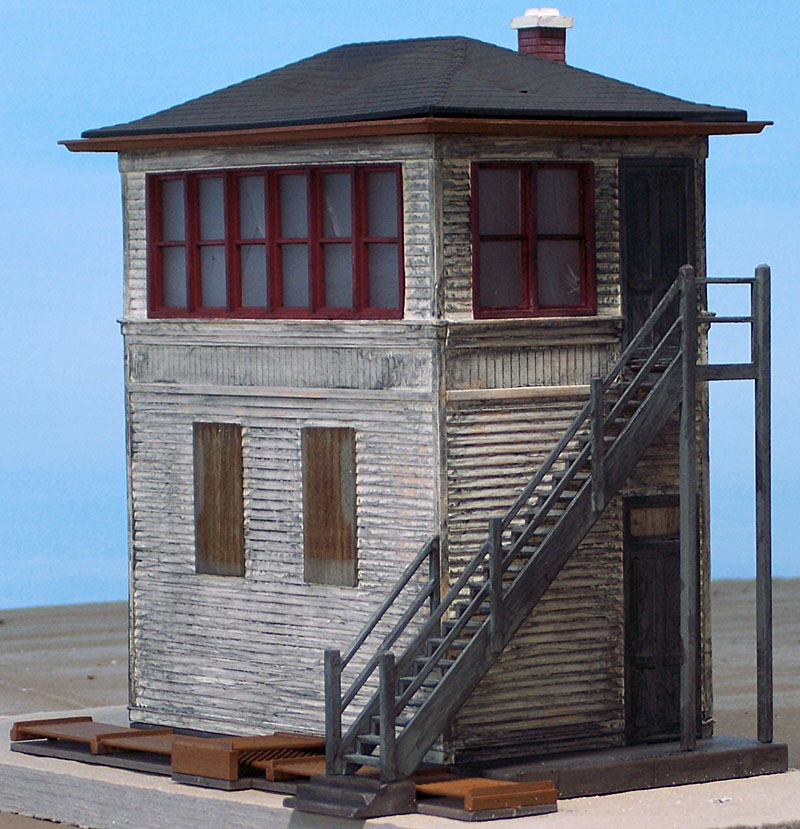
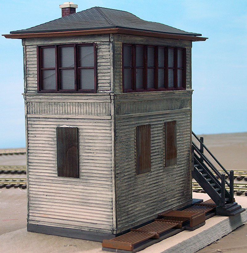
Walthers O Scale Tower Kit.

av_tower_02.jpg


av_tower_03.jpg
 
Charles S./Charles H.
Excellent detailing with your town shops. Maybe someday, I will get beyond having only the bare building walls placed in the towns :o. Ah! So much to do. :D.
 
Thanks for the comments fellas.

Charles H.

I really like your signs and the awning looks great. I bought the same kit long ago in resin. I think it's plastic now.

The radio shop was patterned after a real place with a similar name in Oakland, CA in the 50s.

It was on College Ave. which explains why the Drugstore is "College Drugs". Visitors think it's a peculiar name for a drug store.:D

Chas.

Yours looks swell! I especially like the radio shop sign and the interiors.


They look fantastic! you should do a tutorial on how you make them.

It's really not that hard. Just take a good look at the real thing and keep an eye on the fonts you use, especially if it's a period job. Fonts...I could pontificate on that one for hours, but I don't want to bore ya!

Railroad-guy- nice woody texture on that tower.
 
Before I made the signs I drove around old Pasadena,CA (about 1987) and took photos of many of those big ol' signs hanging in front of older shops. They gave me all the ideas I needed. Now with Photoshop and vintage adverts on the web it's even easier.

Also check Morning Sun books on streetcar topics for lots of great city signs and store front pictures - and all in color! The LA Ry one is especially good. When I started the hobby everything was cheaply printed, fuzzy, black and white photos. It's much better now.


Affiliate Disclosure: We may receive a commision from some of the links and ads shown on this website (Learn More Here)

Back
Top