B&W photo makes it hard to tell what is going on. Seems like this could be natural wood with something like boxcar red-ish lettering? This flat is from 1904 - no idea how often cars went unpainted in those days. This was from Barre VT so the elements would have been fairly severe running in a year round capacity. Curious if anyone has any experience/opinions here?


You are using an out of date browser. It may not display this or other websites correctly.
You should upgrade or use an alternative browser.
You should upgrade or use an alternative browser.
Thoughts on paint color (or lack thereof)?
- Thread starter Vince-RA
- Start date
ModelRailroadForums.com is a free Model Railroad Discussion Forum and photo gallery. We cover all scales and sizes of model railroads. Online since 2002, it's one of the oldest and largest model railroad forums on the web. Whether you're a master model railroader or just getting started, you'll find something of interest here.


Note that the metal pieces, stake pockets, bolsters, grab irons appear to be iron painted black, also a very common practice for that era..

The platform can only really be of wood (i would have thought softwood as it is easiest, but who knows what was growing nearby?, maybe check the geo-biology of the area) and the letters would likely be in redish iron-pigment paint as it was in plentiful use and super easy to produce.
As for the color of the clothing, perhaps it might be worth visiting a clothing museum and seeing some samples, although i think the denim was likely a grey to blue with dust and dirt (if all the farming and mining museums i have been to are anything to go by") )
)
The stone is difficult though, obviously "granite" from the sign which could be a whole load of colors. Looks more like a chalkstone or sandstone block from the shade and texture though :/
Granite from other parts of Vermont is different. Woodbury/Hardwick granite is darker with a coarser grain, Bethel is typically much lighter, almost looking like marble.
I haven't been super happy with my attempts to find a suitable paint color, but I'm getting there - effectively it's a very light gray from a distance. The challenge is that just flat gray doesn't look right, but I've been able to improve the look by adding multiple layers of different colored weathering chalk on top of the paint.
I too have been experimenting with stone, and this is the best I have got so far.. although I'm going for limestone, but the color of that granite in the pic might work, I used "neutral grey" + "grey umber" with the highlight and lowlight technique I mentioned.

Affiliate Disclosure: We may receive a commision from some of the links and ads shown on this website (Learn More Here)
CambriaArea51
Well-Known Member
Looks fairly new, they built the car so most likely they didn't paint it. Looks like lumber that's a little aged.
logandsawman
Northern Pacific history enthusiast
I think the top of the deck was painted, it seems like a little bleed on the top of the end grain of the deck boards.
The long beams/stringers appear to be steel/iron and I believe these to be painted with lettering over the paint. The shorter sill beams under the stringers appear unpainted. If there are any old advertising logo's out there that may give a good indication of color for the stringers, I will guess yellow with brown lettering.
My opinion, in general after viewing hundreds of old photos trying to figure out colors from a black and white photo, is that these wooden rail cars were painted regularly as an advertising tactic, also an indication of good management.
There are many old outside braced box cars in farm yards of Minnesota, and many still show some of the paint. However, in old photos I rarely see areas (especially box cars) where paint may be peeling or any discoloration other than fading.
Dave LASM
The deck appears unpainted and the frame is painted wood.
It is very difficult to identify exact colors in early photos because the B&W film used in those days did not react the same to different colors. Depending on the film sensitivity, red could be anything for near white to near black. Yellow often came out as a dark grey. That's why many steamers look like they have no lettering on the tender because the yellow lettering was rendered almost the same color s the black tender.
If I had to guess I would say the car was a straw color (a pale yellowish tan) with black lettering.
For example, here is a B&W picture of a British fighter plane. Guess what colors are on the roundel :
.jpg")
Here is a color drawing of the same of the same roundel. Note the almost black outer ring is actually yellow. The dark blue ring is rendered lighter than the red center. Note also the "flag" on the tail has the red leading stripe, lighter in color than the blue trailing stripe.

Here is a color drawing of the same of the same roundel. Note the almost black outer ring is actually yellow. The dark blue ring is rendered lighter than the red center. Note also the "flag" on the tail has the red leading stripe, lighter in color than the blue trailing stripe.
The beauty of this exercise is there is almost no wrong answer, so long as the wood is a lighter color than the lettering  So far I have done boxcar red lettering on white and boxcar red lettering on stained (with black paint and isopropyl alcohol) wood. The white looks too bright to my eye and would probably benefit from some weathering. The stained wood is probably too dark - looks great for the deck, like creosoted wood, but the lettering gets lost on the sideboards. Working on another variant with a light brown stain, again with the boxcar red lettering, right now. I'll post a comparison when I finish. Might also be interesting to see how conversion of modern color photos to B&W looks against the one above.
So far I have done boxcar red lettering on white and boxcar red lettering on stained (with black paint and isopropyl alcohol) wood. The white looks too bright to my eye and would probably benefit from some weathering. The stained wood is probably too dark - looks great for the deck, like creosoted wood, but the lettering gets lost on the sideboards. Working on another variant with a light brown stain, again with the boxcar red lettering, right now. I'll post a comparison when I finish. Might also be interesting to see how conversion of modern color photos to B&W looks against the one above.Yeah, I get it, but not much I can do here without knowing the characteristics of the film that shot the original picture or having some contemporaneous descriptions of the car. It hasn't been difficult to find written descriptions of the paint schemes for locomotives of the era/road, but I have virtually no information about rolling stock, alas. I can make educated guesses about dark boxcars with light lettering, or even reefer cars with light paint and dark lettering, but this is much less straightforward. And make that MUCH less straightforward, after seeing your fighter plane pic 
Very few flatcars were painted white that I have seen. I suggested yellow/straw because yellow or straw colors were very popular for rail cars in that era. Yellow indicated speed or priority (why 1880's passenger cars and refrigerator or express cars were often painted yellow.) Dark browns conveyed elegance so a lot of the 1890's passenger cars were painted dark browns (think UPS truck). The dark olive greens weren't popular until the late 1890's-1900's. The lettering could be anything from a dark red to a brown to a black. Dark olive greens were made by mixing black and yellow paint. Very few cars operating in interchange service would be unpainted and since that car is a uniform color, it was almost 100% certainly painted. You can't see the grain in the main frame.The beauty of this exercise is there is almost no wrong answer, so long as the wood is a lighter color than the lettering
Note that the metal pieces, stake pockets, bolsters, grab irons appear to be iron painted black, also a very common practice for that era..
dgrafix
Well-Known Member
As far as the colour of wood, skin, hair, iron and stone goes -nothing- has changed, other than treatment and fashion. It would basically look the same color wise then as it would now. The tiles would have been terracotta or slate most likely.B&W photo makes it hard to tell what is going on. Seems like this could be natural wood with something like boxcar red-ish lettering? This flat is from 1904 - no idea how often cars went unpainted in those days. This was from Barre VT so the elements would have been fairly severe running in a year round capacity. Curious if anyone has any experience/opinions here?
View attachment 170647
The platform can only really be of wood (i would have thought softwood as it is easiest, but who knows what was growing nearby?, maybe check the geo-biology of the area) and the letters would likely be in redish iron-pigment paint as it was in plentiful use and super easy to produce.
As for the color of the clothing, perhaps it might be worth visiting a clothing museum and seeing some samples, although i think the denim was likely a grey to blue with dust and dirt (if all the farming and mining museums i have been to are anything to go by
)The stone is difficult though, obviously "granite" from the sign which could be a whole load of colors. Looks more like a chalkstone or sandstone block from the shade and texture though :/
Last edited:
This is actually the one part that is easy - Barre granite is fairly uniform in color and grain, that's part of what made it into the so-called "Granite Capital of the World". Color can vary a bit from quarry to quarry of course, but generally the unpolished stone looks a lot like this: https://www.usgs.gov/media/images/barre-graniteThe stone is difficult though, obviously "granite" from the sign which could be a whole load of colors. Looks more like a chalkstone or sandstone block from the shade and texture though :/
Granite from other parts of Vermont is different. Woodbury/Hardwick granite is darker with a coarser grain, Bethel is typically much lighter, almost looking like marble.
I haven't been super happy with my attempts to find a suitable paint color, but I'm getting there - effectively it's a very light gray from a distance. The challenge is that just flat gray doesn't look right, but I've been able to improve the look by adding multiple layers of different colored weathering chalk on top of the paint.
dgrafix
Well-Known Member
Cool, looks almost like limestone (color wise). All the granite where i live looks live everthing from white quartz like crystals through pink to almost looking like limestone which looks very similar to that. It looks so bright in the picture though!This is actually the one part that is easy - Barre granite is fairly uniform in color and grain, that's part of what made it into the so-called "Granite Capital of the World". Color can vary a bit from quarry to quarry of course, but generally the unpolished stone looks a lot like this: https://www.usgs.gov/media/images/barre-granite
Granite from other parts of Vermont is different. Woodbury/Hardwick granite is darker with a coarser grain, Bethel is typically much lighter, almost looking like marble.
I haven't been super happy with my attempts to find a suitable paint color, but I'm getting there - effectively it's a very light gray from a distance. The challenge is that just flat gray doesn't look right, but I've been able to improve the look by adding multiple layers of different colored weathering chalk on top of the paint.
Last edited:
dgrafix
Well-Known Member
Another thought, have you tried giving the stone a black wash after you painted & dried it? Like 1 part black paint to 5 parts water or IPA? It will not stain the flats much but will get into the details and lowlight them. Then when everything is dry, get a very very very dry brush (like dip in paint and then paint some paper until there is almost nothing) with some titanium white and just lightly brush the details from high to low. This will define & highlight all the edges.This is actually the one part that is easy - Barre granite is fairly uniform in color and grain, that's part of what made it into the so-called "Granite Capital of the World". Color can vary a bit from quarry to quarry of course, but generally the unpolished stone looks a lot like this: https://www.usgs.gov/media/images/barre-granite
Granite from other parts of Vermont is different. Woodbury/Hardwick granite is darker with a coarser grain, Bethel is typically much lighter, almost looking like marble.
I haven't been super happy with my attempts to find a suitable paint color, but I'm getting there - effectively it's a very light gray from a distance. The challenge is that just flat gray doesn't look right, but I've been able to improve the look by adding multiple layers of different colored weathering chalk on top of the paint.
I too have been experimenting with stone, and this is the best I have got so far.. although I'm going for limestone, but the color of that granite in the pic might work, I used "neutral grey" + "grey umber" with the highlight and lowlight technique I mentioned.
Attachments
Last edited:
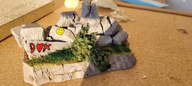
That's a great idea, thanks! My wooden "granite blocks" don't have as much texture as the ones in your photo but that technique would definitely add some depth. Unfinished granite blocks tend to either have obvious holes from drilling, or look more like pieces have been "flaked" off. The former, I have had some success replicating by drilling holes (though they are still much too ragged for my liking due to wood fibers) - but the latter I still struggle with. Using a dremel with a sanding drum works, sort of, but it's easy to overdo it. Anyway - i think the more texture I can get in the blocks, the better the wash/highlight technique will work.
dgrafix
Well-Known Member
I used some peices of XPS 300 foam for rocks and base (the kind they use for insulation) not quite the same stuff as styrofoam (EPS). It's the same plastic but formed very differently & is much more dense. This stuff you can carve, sand and melt into shape really easily. After you seal it with some watery PVA or modpodge it kind of goes hard and more like a plaster.
Last edited:
Turned out a little more mustard and a little less straw but I think it looks pretty sharp (though it's amazing how clearly a crooked stake pocket shows up in a photo...). The lettering is roughly boxcar red (home printed decals) and the fittings are MicroLux "Box Car Red" which is very much less red and more brown than any other Box Car Red I've seen before.
 Just for fun here's a modern B&W version:

Affiliate Disclosure: We may receive a commision from some of the links and ads shown on this website (Learn More Here)