Custom Signs


Raincoat2

Well-Known Member
When you want to make a sign (for a business, industry, etc.), what are your techniques? So far I've been printing out signs on white paper, cutting to size and pasting to the plastic sign. But that does not look very professional. (See my post today on the Coffee Shop forum). I model HO scale. Give me some ideas on how to improve the looks of my signs.
 
Would printing on clear plastic solve the issue? When I had to make transparencies for overhead projectors, I'd tape the clear plastic sheet to a piece of paper so the printer would recognize that it had something in it to print on. This assumes you have an inkjet printer and not a laser, although they do have films that will go through a laser printer.
 
Johnny: I make my signs using an Excel program on my PC. I size the sign(s) to allow for a black outline that I use as a cutting guide, but first glue the sign on a piece of styrene to mount on the billboard or other sign.

I print the signs using the highest quality printing and also print a colored background.

I keep the correct size sign as a template for other signs.

Greg

###########################

IMG_0372.JPG
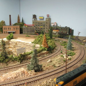
There a smaller sin by the quarry for the owner Flintstone & Sons and one on a billboard sign on the building in the rear, right of the water tower.-Greg
 
Last edited:
When you want to make a sign (for a business, industry, etc.), what are your techniques? So far I've been printing out signs on white paper, cutting to size and pasting to the plastic sign. But that does not look very professional. (See my post today on the Coffee Shop forum). I model HO scale. Give me some ideas on how to improve the looks of my signs.
I cannot find your Coffee Shop post from this morning!
 
Here it is, Willie. That awful white sign on the roof - not very professional looking. That's what i want to be able to improve.

Outpost2.jpg
 
It's actually not a bad sign, but could use a little bit of embellishment. I like the combination of fonts, maybe give it a very light green background (outdoorsy), with a narrow black border. Center it better if you can, bottom half should be a bit lower.
 
Johnny: My suggestion is to use a smaller font for "CAMPING - FISHING - HUNTING" and do the "Aaron's Outpost" in Bolder and a larger font. The sign also needs a background color.

I would also use a rectangle sign without the cut outs.

Willie:
Has some good suggestions.

Greg
 
Last edited:
Okay - - I went low-tech and printed n white paper: changed the fonts, the font size, the print color, and added a background color, plus made it a rectangular sign rather than cutouts. All good ideas from you guys. I might consider printing on clear plastic, as some of you suggested, for future projects.

So, what do you think? I think it looks way better than the original one (posted in #5 above).

Outpost4.jpg


Back
Top